As anyone who hasn’t been
living under a mini-ramp for the past year will know, “Thrasher” hoodies
and T-shirts have been having something of a fashion moment. Much, it has to be
said, to the dismay of a great many skaters – even the San Francisco skate
magazine’s legendary editor-in-chief Jake Phelps weighed in, clarifying that
they “don’t send boxes to Justin
Bieber or Rihanna or those f***ing clowns”.
I’m not entirely sure
why Thrasher’s iconic logo percolated from the margins of culture,
where skating lives, into the mainstream some time around 2016. After all, it’s
been in existence since 1981, and the font, Banco, was designed back in the
Fifties by a Frenchman, Roger Excoffon. The first Thrasher jumper
I ever owned I bought off my friend Jasper in 1995 for £5 after he’d got hot
rock burns in the sleeves and left it in a bush down the side of his house for
a year. It was far and away my favourite teenage item of clothing, until I left
it in a bush somewhere around 1998. (Sorry, I digress, but I feel the need to
add this in as I’ve felt the Insta-wrath of some skaters who seem to think that
I can’t possibly work for a style magazine and be an actual, real-life skater.
I might be rubbish and look like I should be playing golf instead,
but I put in the hours and have the scarred knees and lack of mobility in my
right hand to show for it.)
A colleague, who writes about the ebb and flow of fashion and at any time looks as if he could have stepped out of the next season’s collections, tells me it’s simply because Thrasher is a damn cool word and the logo looks good. “Say it,” he said. “See, even sounds cool.” You could call it visual onomatopoeia but that would probably get you a punch at your local skatepark. True as this might be, it doesn’t explain why Thrasher above all others has caught the mainstream imagination, when skating is strangely blessed with a plethora of iconic and enduring logos that stand the test of time and sound damn cool – any of which could have blown up. The irony is that most skate brands have minimal money (or none) to invest in marketing and some even go out of their way to shun mainstream media – yet some of skate logos and graphics are strokes of genius that are instantly recognizable and stand head and shoulders above high street and high-end clothing brands that attempt to ape the aesthetic.
There are tens, maybe
hundreds of other skate brands around the world and they’re all rad, but these,
in my arbitrary opinion, are the top seven skate logos ever conceived.
Independent Trucks
Trucks are the part of a skateboard set-up that anyone who has never skated simply doesn’t understand – the metal things that hang off the board and connect to the wheels. “What do you mean it’s not the board but it’s not the wheels either?” Thus, Independent will always have kudos for being ever-uninterpretable by the masses, but it’s on my list because of its Alisee Cross logo. It’s so simple and in its almost quasi-militaristic way (it’s not the Iron Cross, however) is the perfect representation of a hard-core hardware brand whose main product pleases skaters the world over with that grinding sound.
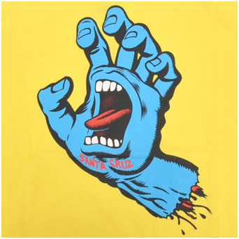
Santa Cruz Screaming Hand
Created by Jim Phillips in 1985 for the archetypal Cali skate brand’s Speed
Wheels line, the screaming hand was actually inspired in part by a drowned man the
artist saw at a beach when he was younger. As art director at Santa Cruz in the
Seventies and Eighties, Phillips penned myriad iconic deck designs for the like
of Steve Olson, Rob Roskopp and Jason Jesse, but it’s the eerie blue screaming
hand that stands out and looks as rad today as it did 30 years ago.
Anti-Hero
A proper skaters' skate brand with a quite beautiful logo drawn by the artist
Todd Francis and a name that sets out it stall. I love this logo but, and
here’s the truth, I sort of don’t have the guts to ride an Anti-Hero board
because I don’t feel I can do it justice – maybe I’ll spend the summer learning
to skate pools and get myself hooked up. Or smashed up.
Zero
Not its skull-drawn-in-blood logo but rather its original, pared-down four
capital letters across the chest: ZERO. About as visually and linguistically
stark as a logo can get but all the more epic because of it. Everything you'd
expect from a brand founded by Jamie Thomas, one of the best ever, a man who
made a career out of tearing up handrails and who was the first person I ever
saw skateboard to Iron Maiden. Mega. Google him.
Girl
Founded in 1993 when some of the best riders in the world at the time (and,
some would say, still now) such as Mike Carroll, Rick Howard and Rick McCrank
defected from World Industries to set up their own skate brand. According to a
video released on their 20th anniversary, the inspiration to use the women’s
loo logo came when Carroll took a comfort break in the ladies during a
brainstorming session at a café (it's OK, the gents' was locked). I’m betting
that a room-full of branding experts on £10,000 a day, sat in a room for a
month, couldn’t have come up with anything better.


No comments:
Post a Comment